Design and engineering,finally on the same page.
114+ components and 41 blocks, matching your Figma file exactly, so designers hand off what engineers already have, and your whole team ships from one source of truth, not a reinterpretation of it. No redlines, no rebuilding it twice.
Built for real products
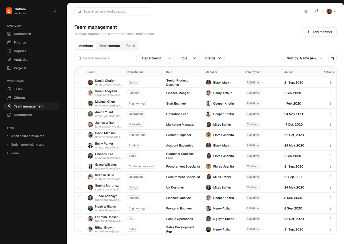
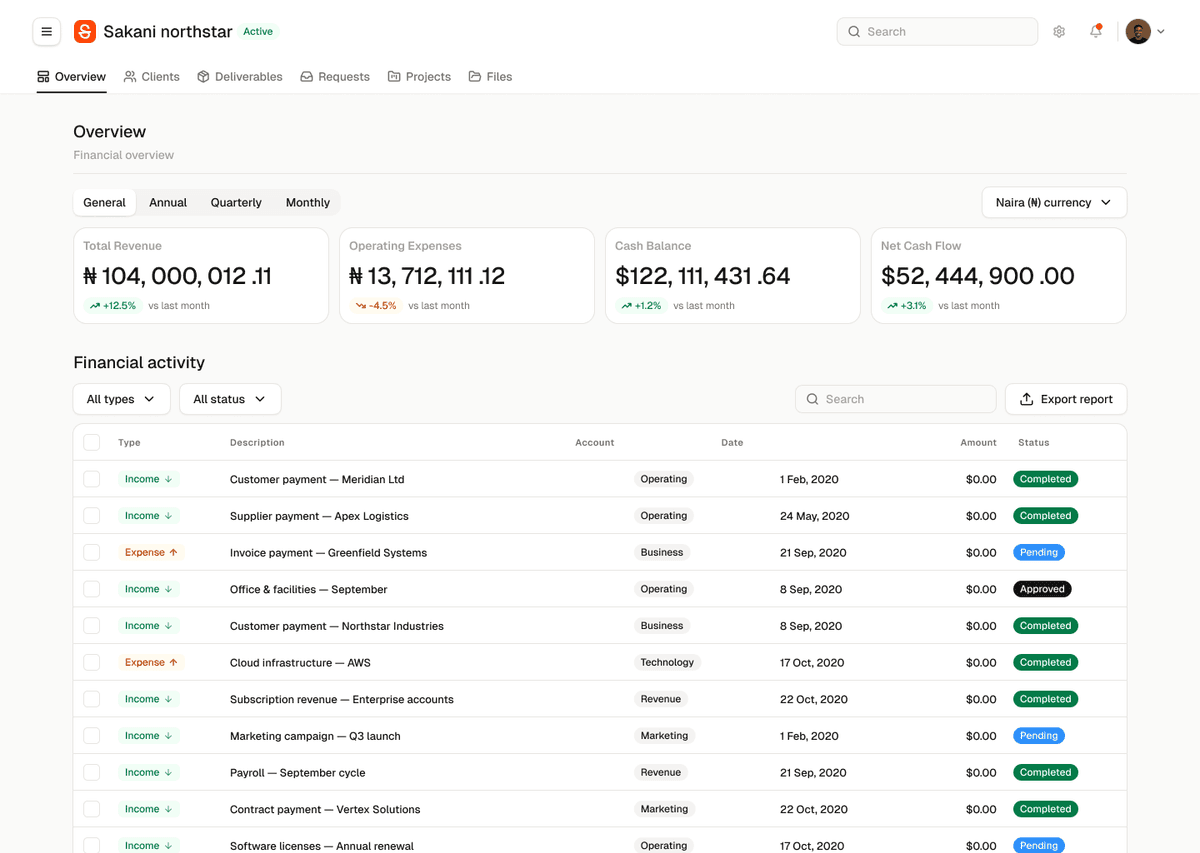
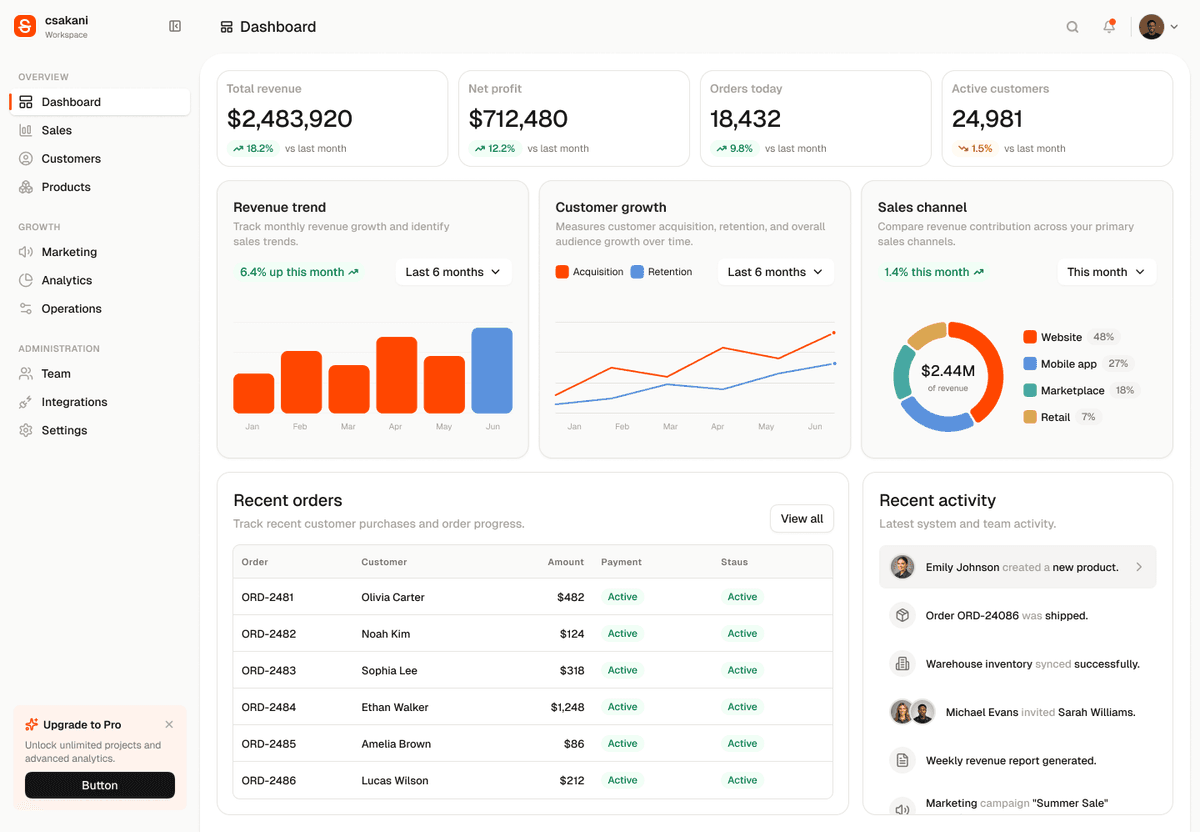
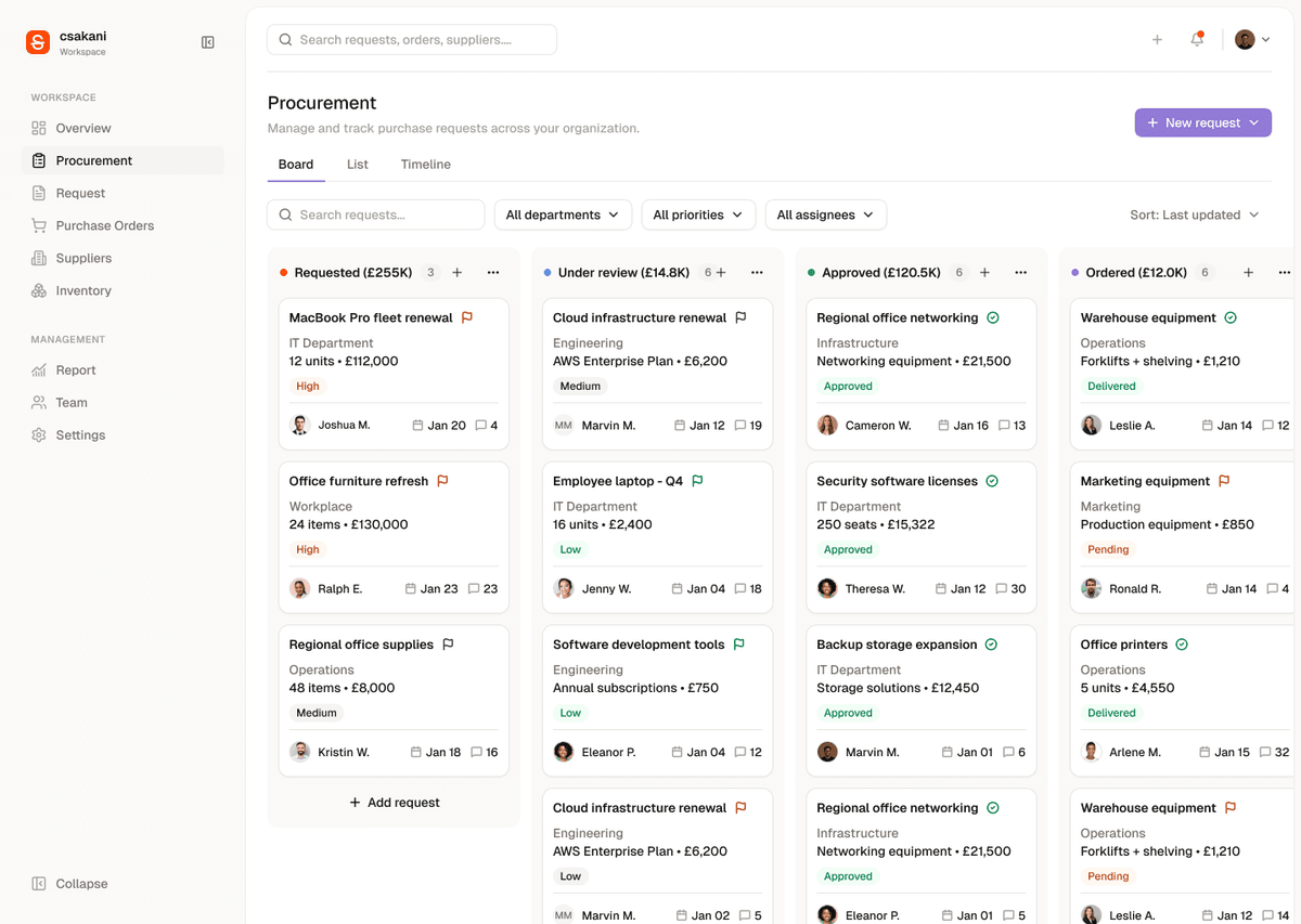
Real dashboards and apps shipped with Sakani.
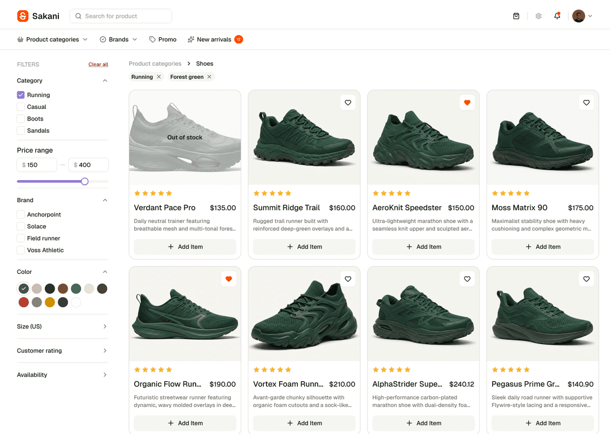
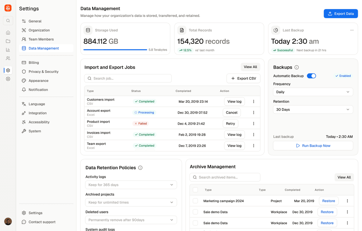
- Financial overview dashboard. Finance
- Procurement kanban board. Procurement
- Team management, dark mode. Team
- Storefront product listing with filters. Storefront
- Data management settings. Settings
- Workspace overview dashboard. Overview
Real dashboards, not mockups
Real Sakani blocks and a real production app, not screenshots: hover the sidebar, switch tabs, scroll the table. It all works.
Everything a real product needs
Not a component playground: a system built to ship actual screens.
114+ components
Every atom, molecule, and pattern in the Sakani Figma file, exported 1:1, not reinterpreted.
41 ready-made blocks
Full page sections (pricing tables, checkout flows, auth screens) meant to be copied and edited, not configured.
Token-driven theming
Every color, radius, and shadow traces back to a CSS variable. Rebrand by repointing the semantic layer.
Dark mode included
Not bolted on after the fact: every component ships with a verified dark-mode pass from day one.
Browse everything
114+ components and 41 blocks, organized by category. Jump straight to the one you need.
Up and running in a minute
Install the package, import the tokens once at your app root, then import any component like you would from any other library.
import '@sakaniui/react/tokens.css';
import { Button } from '@sakaniui/react';

export function Example() {
  return <Button variant="primary">Get started</Button>;
}
Frequently asked questions
Yes. MIT licensed and free to use in personal or commercial projects, no attribution required.
Sakani only depends on React 19 as a peer dependency, so there's no framework lock-in. This docs site is itself a Next.js app; the same package works identically in Vite or CRA.
Yes. Components ship their own CSS Modules bound to CSS custom properties, so they don't conflict with Tailwind classes on surrounding elements. This docs site does exactly that, using Tailwind for its own layout while every color comes from Sakani's tokens.
shadcn/ui hands you generic source to copy, paste, and restyle into your own design language. Sakani starts from the other end: every component is a 1:1 export of a real, maintained Figma file, so the tokens, spacing, and states you see in design are exactly what ships in code, with no restyling pass and no drift between design and build. It's also an installable npm package, not a folder of files to maintain yourself: `npm install`, import, done, with dark mode and 114+ components covered from day one. Blocks stay copy-and-edit, same as shadcn's; that model is genuinely the right fit for full page sections you're meant to customize.
Not through props: blocks intentionally ship a small, fixed set of states (loading, empty, error, etc.) rather than a large configuration API. To go further, copy the block's source file from GitHub into your project and edit it directly.
Not yet. Today it's a standard npm install. A shadcn-style registry for copying block source directly into a project is on the roadmap.